
Transitioning to a new career can often seem like an impossible move to make, especially if you have devoted years to a specific role or industry. But, with more and more local businesses beginning to offer schemes for career transition in STEM fields, the prospect is more viable than ever.
Web design is a popular choice of career for many, as demand for competent coders and designers continues to increase – but there are a number of tools and processes with which you need to be familiar before you can start a career in the industry.
Full-service web design solutions like Editor X exist, providing a comprehensive range of features that enable the user to follow the web design process from planning to launch. With collaborative working, team members and clients alike can also access the same project, share feedback and share assets; templates are also available for quick prototyping. But what tools and features do solutions such as these incorporate to produce a fully-fledged site design? What are the systems that web designers use to complete a project, and the digital gadgets which help them along the way? Here are six tools that are deeply useful to the web design process, and how they work.
Wireframing Software
In the ‘layouting’ stage of any web design process, creating visual mock-ups of potential page ideas is key to making concrete decisions on the form of each page. Much like you might plan the layout of a room with blueprinting or CAD software, you can create wireframe layouts of webpages using wireframing tools. Wireframes are simply bare-bones layout designs, webpage blueprints drawn up to illustrate which elements might appear on a page, what size they might be and how they might be oriented. Specific tools exist to draw up these schematics, with presets and assets for quick design – saving valuable development time that might have been spent drawing individual elements.
File-Sharing Tools
If you are working as part of a larger team, being able to share files with one another is crucial. Emailing mock-ups and brand specifications back and forth is a recipe for disaster, as email chains – and crucial attachments – can easily get lost. Cloud-based file-sharing solutions can be particularly useful here, where access to a folder can be granted to team members across the room or on the other side of the country.
CMS Platform
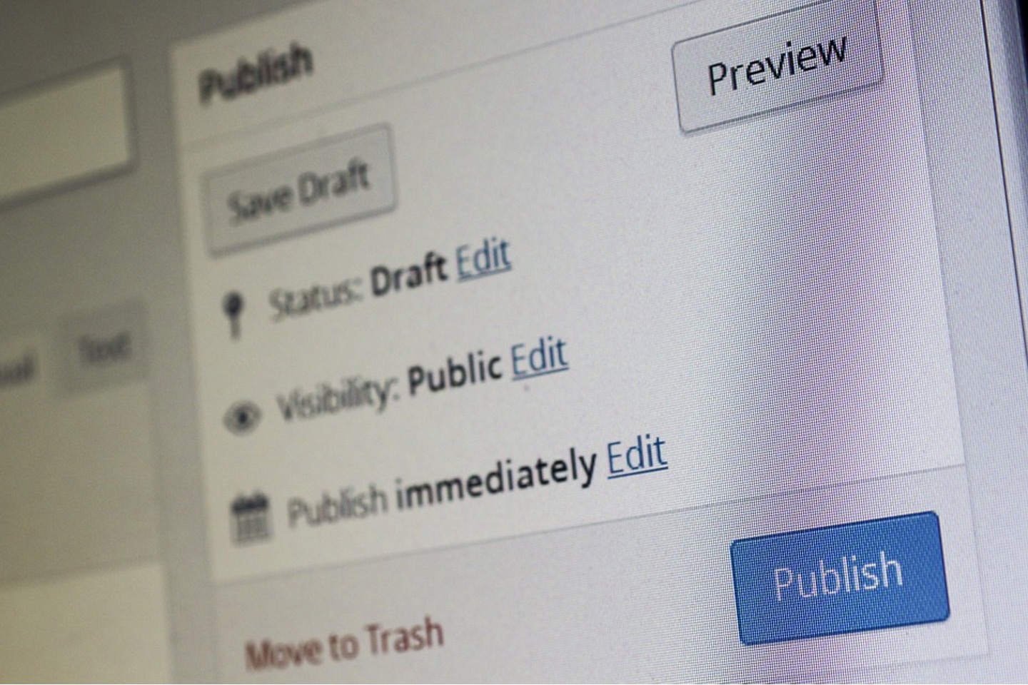
CMS stands for Content Management System, and, in small part, carries out a similar task to file-sharing solutions. However, a CMS is much more powerful and vital to the management and upkeep of a site. They are the site’s backbone, enabling editing and alteration from the back end without having to code each change in HTML. A CMS acts as a central portal, through which colleagues can update and iterate digital content before publishing on-site, whether in progress or live; different users from different departments can use the CMS for their own purposes.
Where cloud-based file sharing allows people to access assets with ease, drafting and editing can be hard to follow – and there are still several steps to adding said assets to a page. CMS enables you to track edit history and progress with ease and offer direct integration with site publishing. In short, collaborative workflow is far smoother on a CMS.
Graphic Design Software
Graphic design tools enable designers to create bespoke assets and images for a webpage, from custom backgrounds to banners and button templates. Many designers use popular photo-editing applications for their powerful colour-balancing tools, especially where photos are included in aspects such as header images. However, some suites also offer vector illustration, meaning you can scale designs drawn as vector graphics to any size without losing image quality. This enables intuitive design, and a crisp outcome regardless of the size requirements of the site location.
UX Tester
UX (or user experience) testing applications are the perfect digital gadget for perfecting a site design in the prototyping stage. They enable you to mock up working local versions of the site, with links between pages and end-user functionality for different platforms from PCs to smartphones and tablets. These applications mean you can finalise the website’s link-map with the end-user’s experience in mind, and test the functionality of certain design decisions. You can also use UX testing to trial unique interactions on-site, before dedicating time to a concept that may not work in actuality.
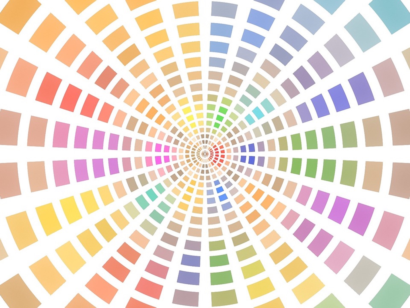
Colour Palette Generator


2 Comments
Pingback: The Ultimate Guide to Web Design Gadgets You Need – Gary Skentelbery | Redstar Digital Marketing
Pingback: Inclusive Web: 7 Creative and Engaging Website Design Ideas | Invision Game Community – Invision Game Community | Redstar Digital Marketing