

Have you ever stopped to think about how lighting transforms the appearance of a home? Changing the lighting could be the feature you’re looking for to change the ambience of a room and dictate the mood with a tap on your smartphone.
You can change the colour and intensity of the light through a light bulb connected to the app on your mobile, to whatever mood you desire. This functionality in hand can make all the difference in your quality of life, pleasure, and relaxation within your home. In lighting, each colour has a meaning and brings a different feeling.
What does each tone of light mean for the ambiance?
White colour (cold light)
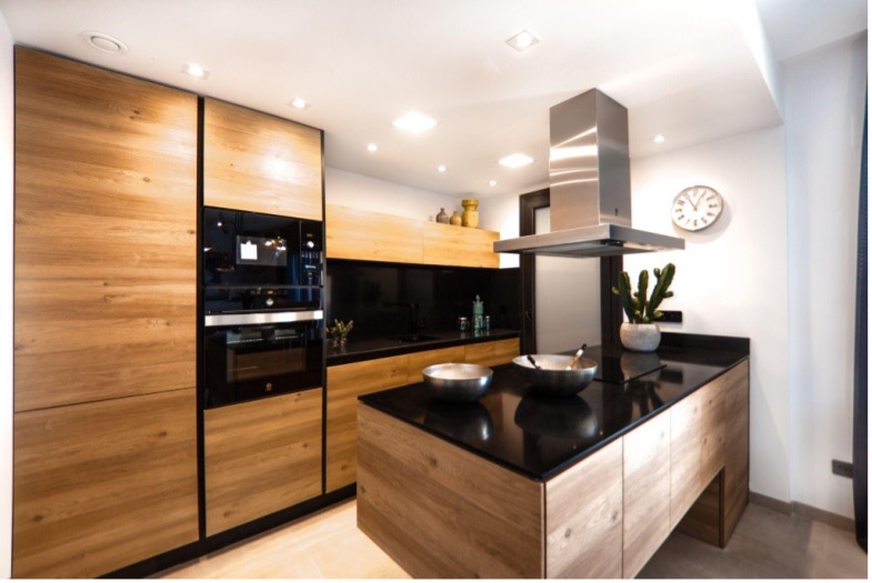
Photo: Ralph Kayden – Unsplash
White is a neutral tone, often used to give the feeling of spaciousness and cleanliness to environments, and also helps when you need to focus on work. White colours are commonly used in offices and work areas such as the kitchen and laundry room. It is a colour temperature that awakens and helps us remain focused on our activities.
Yellow (warm light)
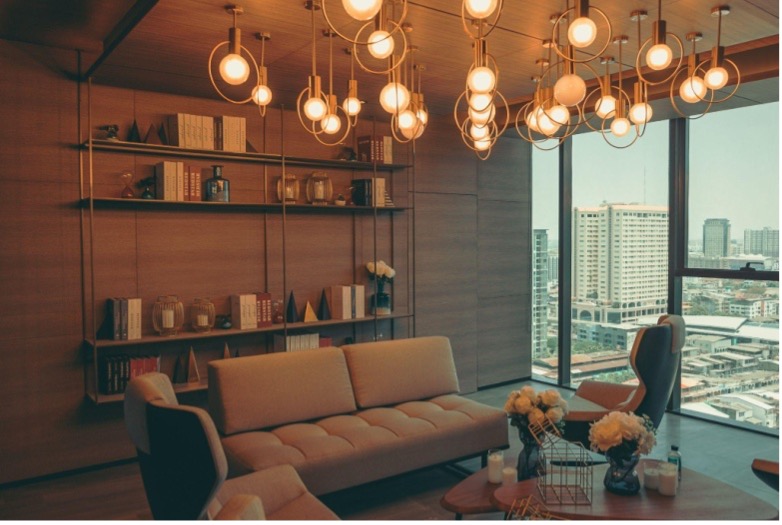
Photo: Zaji Kanamajina – Unsplash
Lighting the environment using warmer tones, that is, in yellowish colours, brings cosiness and relaxation. Warmer tones are ideal for lighting areas of rest, such as the bedroom, and common areas, like the living room. It brings a cosy feeling to the space, having the opposite effect of white light.
Lights with warmer tones promote more natural lighting that makes the environment more pleasant and prevents you from becoming visually tired because this type of light tends to soften the expressions of the face. These natural tones are also perfect for socialising with friends or family, as they will put your guests at ease.
Orange tones
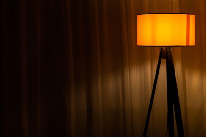
Photo: engin akyurt – Unsplash
Lights with orange tones produce a chromatic effect that stimulates the area of the brain responsible for communication. Therefore, it is suitable for living spaces, such as dining and living rooms. Soft hues, like peach, make the atmosphere comfortable, while more intense shades suggest stability.
Pink and red lights
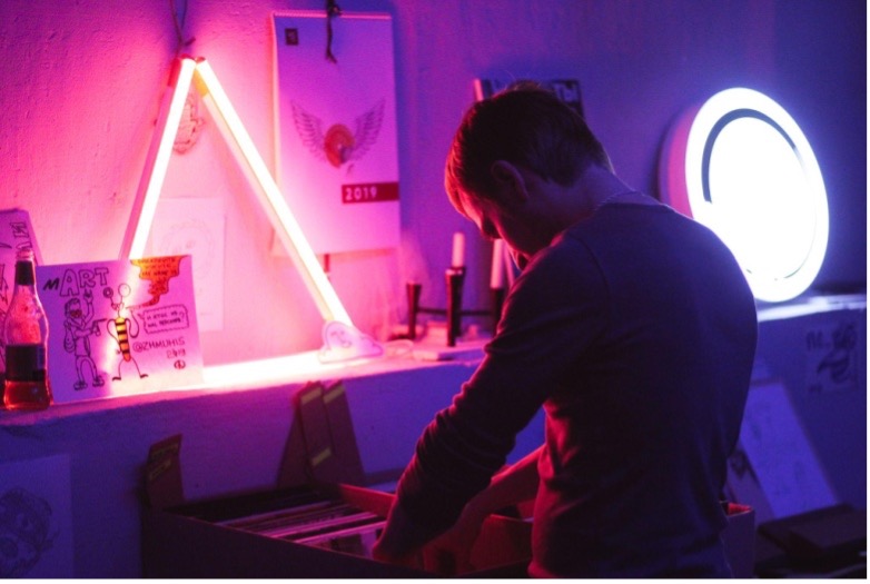
Photo: Pavel Anoshin – Unsplash
Pink and red lights stimulate the areas of affectivity and sociability. Be cautious about these tones, as too much can incite irritability and nervousness. Pink and red lights are perfect for more intimate surroundings or directed to items to generate emphasis.
Purple and violet lights
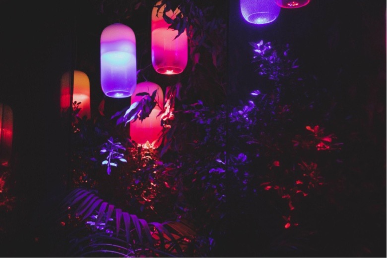
Photo: Federico Lancellotti – Unsplash
Purple and violet lights are one of the colours with more unusual applications. Although these tones are popular in bedrooms and projects aimed at females, the lighting in shades of purple is also present in aircrafts, due to its relaxing properties.
Quietness and calm are also associated with this shade, whereas darker tones suggest mystery.
Blue light

Photo: Siednji Leon – Unsplash
The colour blue is associated with emotions of fullness and freedom, which can vary according to hue. Light blue, for example, is recommended for calm environments. For example, painting or applying indirect lighting in soft tones can calm agitated children. Darker hues suggest productivity and power.
Remember to match the lighting conditions to the feelings you want to feel off in each room, and make sure the light you apply matches your decorative items. Try to avoid huge contrasts or total monochrome. The aim is to experiment and explore. The alternatives and combinations are endless and can be changed. Discover new settings by adjusting the tone, intensity and lighting transitions.


