WARRINGTON Wolves Rugby League Football Club has unveiled a new brand identity at a launch event at Pyramid, Warrington last night attended by players, fans and sponsors.
Developed by Fogg Associates the new brands first public appearance will be at the highly anticipated Wigan game this evening (Thursday).
Over the last three months the club has been working with the Warrington-based agency on a fan research study exploring perceptions and opinions of the club focusing on both the brand and the club’s operations.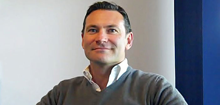
Following Roger Draper’s arrival as chief executive in March 2015 the club will be seeing a number of changes throughout the remainder of the year.
Roger (pictured) said: “Our new brand signifies just the start of a very exciting journey for the club.
“Listening to our fans has given us the direction we need to become more connected to our supporters. We want to reward their loyalty and give them a club they can celebrate and be proud of both on and off the pitch.”
Chris Fogg, Founder Fogg Associates, added: “The new identity has been designed by the fans. While the Wolf is still an incredibly important aspect of our brand fans have reminded us that both the town, Warrington and the name, The Wire, play a crucial part in our club’s success. Our new logo captures both the heritage and the future of our club.
“Over the next few months we will be launching a new-look website and membership scheme.”
Along with the new identity Fogg Associates created a highly emotive video to launch the new brand. This was supported by a series of presentations made to key stakeholders involved in the project including players and sponsors.


13 Comments
Great that it says ‘The Wire’ on it but honest opinion… that wolf has no ‘bite’ and the rest is boring too. Sorry I don’t like it at all and it’s way too soft and wimpy 🙁
Pretty much agree with you Dizzy – great to see the club promoting The Wire brand again but the Wolf does lack bite.
Mind you the older we get the less we like change so may be it will grow on us?
Hashtag Teddy George think that it sounds like a roaring idea for success 🙂 LIKE Teddy George to see what the Mayor and Mayoress are up to.
Frankly it looks awful, reminds me of some American basket ball logo. My three children who are all big fans of the Wolves saw it last night, they all said it was terrible…. not sure what is wrong with the current one !!
I actually quite like the new look logo, although I would like to see a version with the wolf having more bite. With that being said, I think it’s good for the club to be bringing up these fresh new ideas as it shows they are moving with the times. Change isn’t always a bad thing.
Never liked the name “Wolves” anyway, so I’m pleased to see “The Wire” getting a mention. I think the wolf looks a bit down in the mouth. Hope the change hasn’t cost anything because its the players on the pitch that make the difference not the brand.
I am sure the research brought up the desire by many old stagers that they missed the name of the Wire being used officially.
Personally I believe the re-use of this name in the title now offers a level of confusion. It is a step backwards in my view, as young supporters would be quite happy with the new Wolves identity going forward.
Keeping the Wire name as a subliminal, supporter-led identity, without the official recognition, would have been my recommendation. It will only die when the old buggers ‘leave the stadium’ so to speak.
In summary, a retrograde step. I am also not very impressed with the voice-over in the film, which puts the emphasis on the wrong words at times and sounds like it is being read, and not that well. However, I like the imagery and old footage.
Initially, I wasn’t quite sure, then on second and third looks, it began to grow on me. Great to see ‘The Wire’ officially recognised. I’ve read the comments about the Wolf, but I feel the piercing eyes are fairly menacing. Refreshes of branding will always create discussion and interest. It gives us fans something else to think about, a nice distraction from thinking about our injury and suspension woes.
The logo does nothing for me but recognising “the Wire” is good. I’d rather the last three months had been spent looking at more important issues though.
These are my views, not those of any teddy bear known by me.
The Wolf’s not as good looking as ‘Wolfie’ but seriously once again I think there is a need for a brand change. Over the years the ‘Wire’ have used the Warrington Borough coat of Arms (there have been 2 changes to my knowledge…the second was designed by George Carter curator of the museum at the time) and I feel that it should still incorporated somewhere after all it is part of Warrington’s History.
It will always be ‘Wire’ I have never heard a cry of ‘now the Wolves’ like the old chant NOW THE WIRE and what about bringing back the music that was played for many years as the players took the field at Wilsderspool…I think it was called Entry of the Gladiators.
This isn’t my favorte design to be honest.
‘Warrington’ looks like a late addition to the logo as it seems to be ‘floating’ above the crest, almost seems an afterthought.
The colours for me are too soft and the wolf looks almost ‘demonic’ with its yellow eyes!
Logo is poor. Colours are too weak as is the stylised wolf. Including the references to the Wire is a nice touch though. You cant design a logo, or anything for that matter, by committee and have a strong result. I suspect the designers realise its rather weak and that is why they have credited the fans so strongly with the design, so as to diffuse adverse comments. Perhaps it would have been better spending the time and money on strengthening the squad because that logo isn’t going to win us any trophies
Not a fan. The previous Wolves logo is well known, is used widely across Town for promotion of the club. You see it on previous sponsors vehicles even now. All that brand awareness is now gone. Likewise, all old merchandise is out of date – and who’s to say those fans will buy new again?
There’s no reason “The Wire” couldn’t have been added to the existing logo – and just what are the club wanting to brand themselves as anyway? It seems adding “The Wire” is a step backwards. Are they “The Wire” or are they “The Wolves”? Although they’re trying to create a clear brand, all this has done is create confusion. If they wanted to revert back to “The Wire” so much, and make a big deal of “Hardwired” then scrap the Wolves entirely.